Contrary to popular belief, making a small space feel truly larger isn’t about mirrors or paint. It’s about structural intelligence and eliminating “spatial friction.” This guide moves beyond decorating tips to focus on re-engineering your home’s flow through smart layouts, volumetric design, and future-proof planning, treating your apartment like a dynamic system, not a static box.
For the urban dweller, the compact apartment is a canvas of constraints. Every square foot is precious, and the daily experience is often defined by a subtle, frustrating friction—the awkward corner, the door that can’t fully open, the living room that doubles as a chaotic office. The common advice is to hang a mirror, paint the walls white, and buy a storage ottoman. These are cosmetic patches on a structural problem.
While visual tricks can create an illusion of space, they do nothing to improve the functional reality of your home. They don’t solve the privacy issue in an open-plan layout or the logistical nightmare of moving a bulky sofa into a new, smaller apartment. The real, lasting solution lies not in decoration, but in spatial design. It requires thinking like an architect, not just an inhabitant.
The true key is to stop seeing your home as a fixed container and start treating it as a dynamic system. This involves understanding and manipulating the flow of movement, light, and function. It’s about re-engineering the very layout to serve your life, not the other way around. This approach transforms a cramped apartment from a source of daily compromise into a clever, highly functional, and genuinely spacious-feeling home.
This guide will walk you through the core principles of this structural approach. We will dissect common layout myths, explore advanced strategies for vertical space and lighting, and provide the tools to plan a home that adapts with you, ensuring every inch serves a purpose without sacrificing an inch of style or comfort.
Summary: Rethinking Flow: A Structural Guide to Optimizing Small Spaces
- Why Open Floor Plans Are Not Always the Solution for Modern Privacy?
- How to Utilize Vertical Space to Double Your Apartment’s Storage?
- L-Shape vs Parallel Layout: Which Works Best for a Home Office/Guest Room?
- The Load-Bearing Wall Myth That Can Collapse Your Renovation Budget
- How to Layer Lighting to Make Small Rooms Feel Twice as Big?
- How to Plan a Living Room Layout That Accommodates Future Modules?
- How to Stage Your Living Room to Look 30% Larger in Listing Photos?
- Why Modular Sofas Are the Only Logical Choice for Renters Moving Every 2 Years?
Why Open Floor Plans Are Not Always the Solution for Modern Privacy?
The open-plan concept was sold as the pinnacle of modern living: a bright, airy expanse perfect for social gathering. Yet for anyone working from home or simply needing a moment of quiet, it has revealed its critical flaw—a complete lack of acoustic and psychological separation. The sound of a kitchen blender becomes the soundtrack to a video call, and visual clutter from one “zone” bleeds into another. This constant sensory overlap creates a subtle but persistent stress, undermining the very comfort the space was meant to provide.
The intelligent alternative is not to rebuild walls, but to embrace the “broken-plan” concept. This design philosophy uses clever architectural elements to create distinct zones without sacrificing light or a sense of openness. It’s about achieving zonal integrity, where each area has a clear function and is psychologically contained. As a case study from Copenhagen Imports shows, using slatted wood dividers and slight changes in floor level can create clear circulation paths and visual separation, enhancing the perception of space while restoring much-needed privacy.
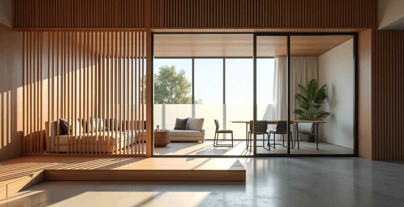
As the illustration demonstrates, elements like glass partitions or wooden slats define areas like a home office or dining nook while still allowing light to flow through. This approach offers the best of both worlds: the connection of an open plan with the functional separation of a traditional layout. It’s a sophisticated solution for the realities of modern, multi-use living.
Action Plan: 5 Steps to Create Acoustic Privacy in Open-Plan Living
- Artful Acoustics: Install high-performance acoustic felt panels (with a Noise Reduction Coefficient rating above 0.85) and disguise them as large-scale wall art to absorb sound without sacrificing style.
- Solid Separation: Replace hollow-core doors with solid-core pocket doors (minimum 1.75 inches thick) between zones. They slide away to maintain openness but provide significant sound blocking when closed.
- Glass with Guts: Create vertical separation using elegant glass partitions that feature a dedicated acoustic interlayer, blocking noise while preserving sightlines.
- Invisible Ventilation: For kitchens open to living areas, integrate downdraft ventilation systems directly into the island. This captures cooking noise and odors at the source before they can travel.
- The Hidden Scullery: Design a “scullery” or prep kitchen hidden behind seamless, flush cabinet doors. This masterstroke contains the chaos and noise of meal prep, preserving the tranquility of the main living space.
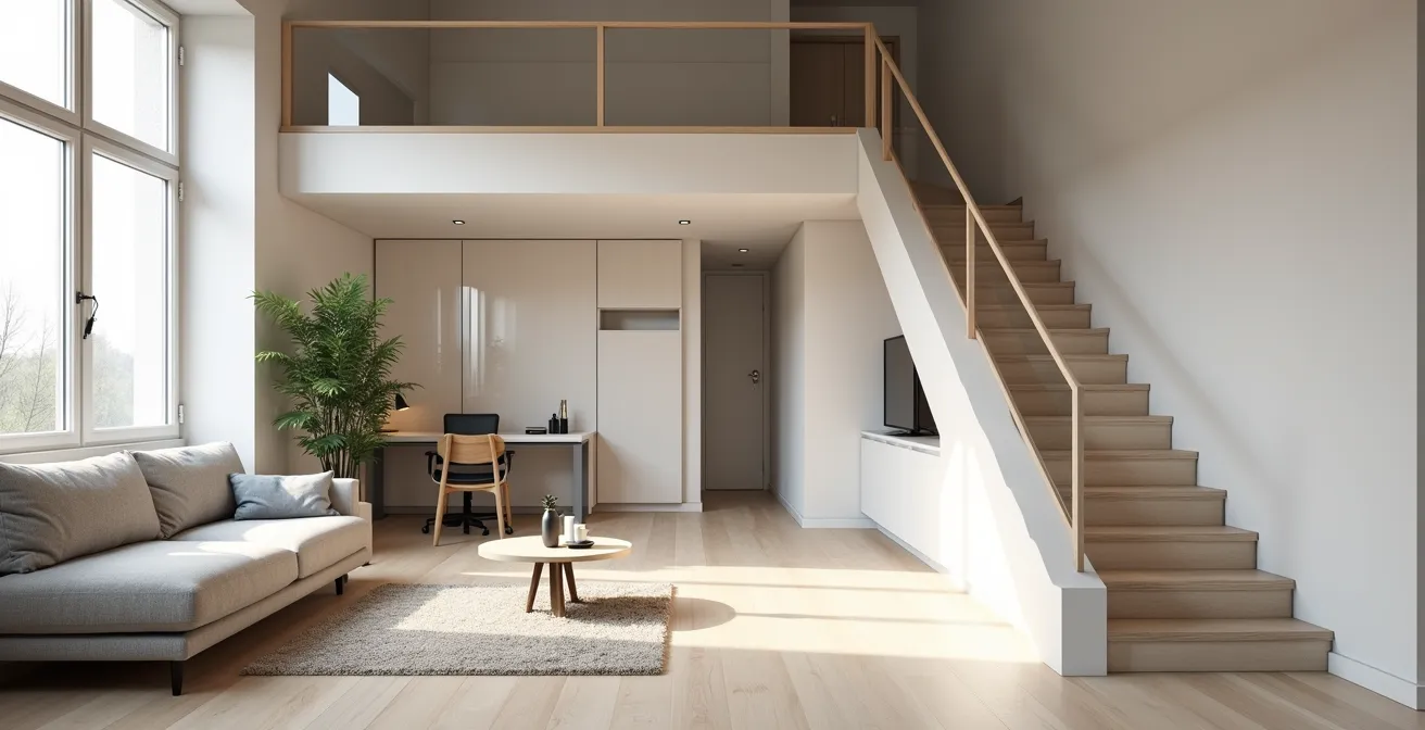
How to Utilize Vertical Space to Double Your Apartment’s Storage?
When you run out of floor space, the only way to go is up. Yet, most people’s idea of “vertical space” ends at installing a few floating shelves. This is a two-dimensional solution to a three-dimensional problem. True volumetric design treats the entire volume of your room as usable space, from floor to ceiling. This means thinking in cubic feet, not just square feet, and looking for opportunities to build upward in a structural way.
The most powerful application of this principle is the residential mezzanine. While often associated with soaring industrial lofts, a well-designed mezzanine can be a game-changer in apartments with ceilings of nine feet or more. It creates an entirely new level for a sleeping loft, a quiet office, or, most commonly, a massive amount of storage. It’s the ultimate space hack, turning unused vertical air into a functional floor. While a large-scale warehouse project might add over 53,000 sq ft with a two-level mezzanine, the principle is scalable. For an urban dweller, even a small 100 sq ft loft creates an entire room out of thin air.
This isn’t just a fantasy. Research shows these installations aren’t just for warehouses; they can effectively double your storage capacity with costs ranging from $35 to $70 per square foot. When you compare that to the cost per square foot of a larger apartment or the recurring expense of an external storage unit, investing in your home’s own volume becomes an incredibly clever financial move.
L-Shape vs Parallel Layout: Which Works Best for a Home Office/Guest Room?
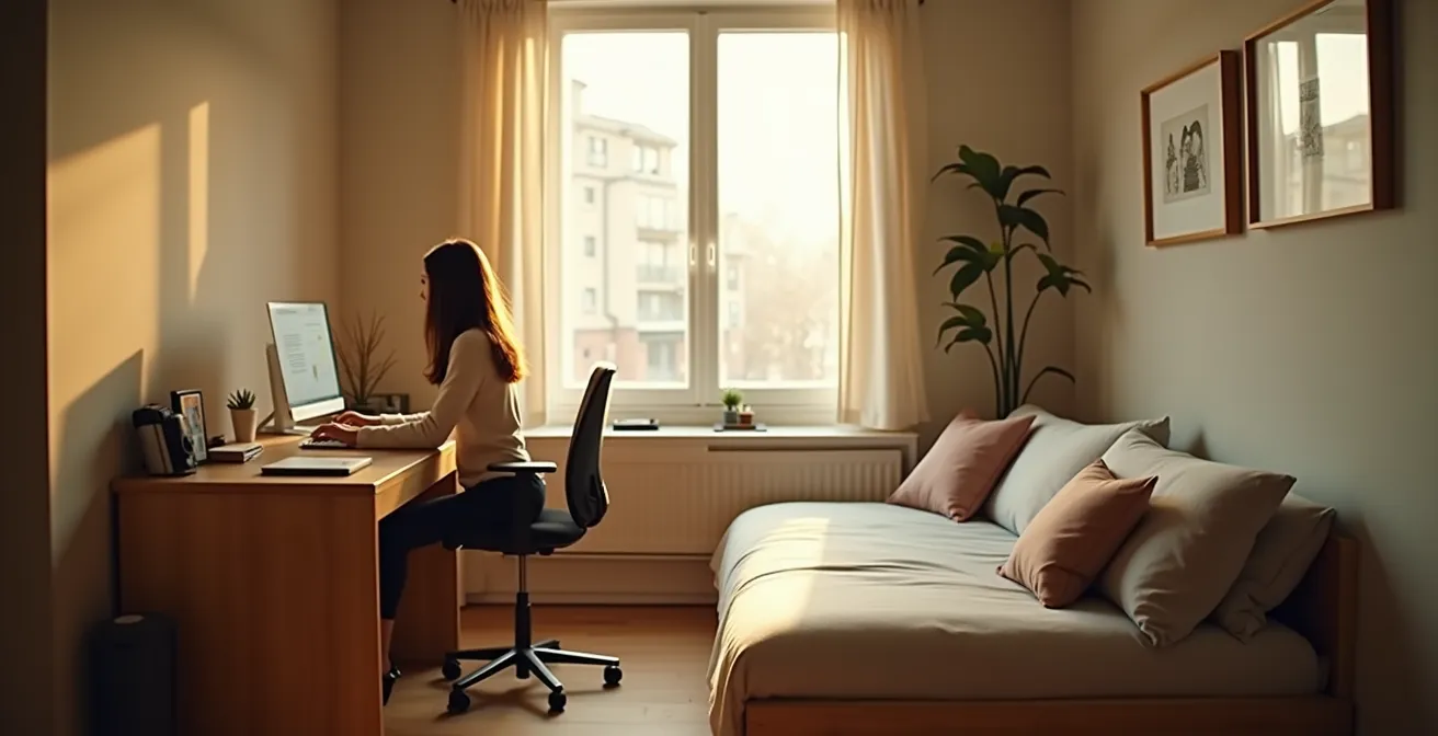
The dual-function room is the workhorse of the modern small apartment. Creating a space that serves as both a productive home office and a comfortable guest room without feeling compromised is a common design challenge. The key to success lies in choosing a layout that minimizes spatial friction—the daily annoyance of having to move furniture or compromise one function for the other. The two most common approaches, the L-shape and the parallel layout, serve very different needs.
The L-shape layout is ideal when the room’s primary function is an office (e.g., 90% office, 10% guest). The desk and its surrounding work area are permanently established along one wall, while a daybed or pull-out sofa sits on the perpendicular wall. The two zones coexist without overlap, protecting the integrity of your workspace from the “guest” function until it’s actually needed. Conversely, the parallel layout places the desk and bed on opposite walls. This is better for a 50/50 split in usage but often requires moving a chair or a small table when converting the space for a guest.
To decide, you must honestly assess the room’s primary role and your tolerance for transformation. For those with sufficient ceiling height (9 feet or more), a third, more advanced option emerges: the Z-axis layout. By building a raised platform for the desk or bed, you create vertical separation, achieving the ultimate psychological divide between work and rest within the same footprint.
This table breaks down the core trade-offs, helping you choose the layout that best fits your life, not just your room.
| Layout Type | Best For | Transformation Friction | Space Efficiency |
|---|---|---|---|
| L-Shape | 90% Office / 10% Guest | Zero – bed and desk coexist | Protects workspace integrity |
| Parallel | 50/50 Split Usage | Medium – requires furniture movement | Better for equal dual use |
| Z-Axis (Raised Platform) | Daily dual use | Zero – vertical separation | Maximum psychological separation |
The Load-Bearing Wall Myth That Can Collapse Your Renovation Budget
In the quest for an open, flowing space, the most tempting target is an interior wall. But the fear of disturbing a “load-bearing” wall stops most renovation dreams dead in their tracks. This leads to a pervasive myth: that any centrally located or thick wall is automatically structural and therefore untouchable. While caution is paramount, this assumption is often incorrect and can prevent you from unlocking your home’s true potential.
A load-bearing wall supports the weight of the structure above it (like the ceiling, the floor of the next level, or the roof). Removing one without adding proper support is catastrophic. However, many interior walls are simply partitions, put in place to divide rooms and bearing no load at all. These can often be removed with relative ease, completely transforming the flow of a space. The critical challenge is knowing how to tell the difference before you spend a fortune on a structural engineer’s consultation.
You are not a structural engineer, and you should never remove a wall without professional confirmation. However, you can become an educated client by learning to spot the red flags. Identifying these clues can help you have a more productive conversation with a contractor and manage your renovation budget effectively, saving you from paying for an assessment on a wall that is obviously structural from the start.
Checklist: Pre-Consultation Load-Bearing Wall Red Flags
- Check the Joists: If you can see the ceiling joists from an attic or unfinished basement, see which way they run. A wall that runs perpendicular to the joists is more likely to be load-bearing.
- Look at the Footprint: Walls located in the center of the home’s overall footprint, especially those that run the length of the house, are strong candidates for being structural.
- Inspect Below: Look in the basement or crawlspace directly beneath the wall in question. If you see a beam, a support column, or another wall directly below it, it’s almost certainly carrying a load.
- Measure the Thickness: While not foolproof, load-bearing walls are often thicker than standard partition walls (which are typically 4-5 inches thick, including drywall).
- Follow the Line: If the wall continues in the same location up through multiple floors of the house, it is very likely a core part of the building’s structure.
How to Layer Lighting to Make Small Rooms Feel Twice as Big?
Poor lighting is one of the biggest culprits in making a small room feel like a cramped, gloomy box. Most homes rely on a single, central ceiling fixture that casts harsh shadows and leaves corners in darkness. The common advice to use light colors and mirrors is a starting point, but it’s a passive strategy. To truly sculpt a space and make it feel larger, you need to think like a lighting designer and actively layer your light sources.
Effective lighting design relies on three main layers. Ambient lighting provides the room’s overall illumination (e.g., recessed lights or a central fixture). Task lighting is focused on specific activities, like a reading lamp or under-cabinet lights in a kitchen. Finally, accent lighting adds drama and depth by highlighting architectural features or decor. In a small space, it’s the clever combination of these layers that creates the magic.
The goal is to draw the eye around the room, both horizontally and vertically. By using techniques like wall grazing (placing lights close to a textured wall) or uplighting (placing lights behind plants or furniture), you create a sense of height and depth. Using different color temperatures, such as a warm 3000K for ambient light and a cooler 4000K for task areas, can also help define different zones within a single room. As design expert Mark Hames notes, strategically placed mirrors can then amplify this layered light, but the lighting strategy itself must come first. It’s an active process of painting with light to make walls recede and ceilings float.
Checklist: Advanced Architectural Lighting Techniques
- Wall Grazing: Install recessed directional lights 6-12 inches from textured walls (like brick or plaster) to create dramatic shadows that emphasize texture and depth.
- Cove Lighting: Place high-quality LED strips (with a minimum CRI of 90+ for accurate color) in ceiling coves or behind cornices to create a “floating ceiling” effect, making the room feel taller.
- Zone with Temperature: Layer warm, inviting ambient lighting (around 3000K) with crisp, focused task lighting (around 4000K) to psychologically separate a work area from a relaxation zone.
- Create a Vertical Axis: Position uplights on the floor behind tall plants, sculptures, or at the base of curtains to draw the eye upward, creating a powerful illusion of height.
- Dramatic Pendants: Use low-hanging pendant lights (hanging 24-30 inches above surfaces like a dining table or kitchen island) not just for task lighting, but to create strong vertical lines that add architectural interest.
How to Plan a Living Room Layout That Accommodates Future Modules?
The modern urbanite’s life is not static. We change jobs, partners, and apartments. Yet, we furnish our homes as if we’ll live in them forever, with fixed layouts and permanent electrical plans. This creates immense friction when life inevitably changes. Future-proofing your living space means designing for adaptability from the outset, creating a “dynamic system” that can evolve with your needs. The scarcity of space in cities is a driving force behind this need for flexibility. In fact, market research indicates that demand for sub-50 sq ft storage lockers is projected to grow at an 8.2% CAGR in dense urban centers, a direct symptom of apartments lacking adaptable storage.
The most forward-thinking approach is to divorce your electrical plan from your furniture plan. Instead of placing outlets based on where your sofa is *today*, create a strategic grid of power sources. This gives you total freedom to reconfigure your room, add new modular furniture pieces, or completely change the function of a zone without being tethered to an inconveniently located outlet. This is the ultimate expression of a flexible home.
This involves installing floor outlets in a grid pattern and increasing the density of wall outlets. For ultimate flexibility, pre-wiring for ceiling-mounted power tracks allows you to move and add light fixtures anywhere you need them. The second part of this strategy is to consciously design with negative space. By preserving designated “buffer zones” free of furniture, you ensure there is physical room to add or rearrange modules in the future. Pairing this electrical strategy with truly modular furniture systems (like those from String or USM Haller) transforms your apartment from a static box into a reconfigurable, living infrastructure.
Checklist: The Electrical Grid Method for Modular Freedom
- Grid the Floor: During a renovation, insist on installing floor outlets in a strategic grid pattern (e.g., one every 6-8 feet in the central living area) to provide power anywhere you might place a sofa or table.
- Densify the Walls: Instead of the standard 12-foot spacing, place electrical outlets every 4-6 feet along primary walls. This ensures you’re never more than a couple of feet from a power source.
- Power the Ceiling: Pre-wire your ceiling for modular power tracks. This allows you to click in, move, and add pendant lights or spotlights with ease as your layout changes.
- Preserve Negative Space: Consciously designate certain areas of your floor plan as “no-furniture zones.” These act as buffers, giving you the physical room to expand a modular sofa or add a new armchair later.
- Choose System Furniture: Build your room’s core infrastructure around true modular systems like String, Vitsœ, or USM Haller. These systems are designed for disassembly, reconfiguration, and expansion, acting as the skeleton of your adaptable space.
Key takeaways
- True optimization is structural, not cosmetic; focus on re-engineering flow rather than just decorating.
- Embrace “broken-plan” concepts over fully open plans to maintain privacy without sacrificing light.
- Think in three dimensions (“volumetric design”) by utilizing vertical space with elements like mezzanines.
- Layer lighting strategically (ambient, task, accent) to sculpt the space and create an illusion of depth and height.
– Plan your electrical grid for flexibility to “future-proof” your layout against life changes and new furniture.
How to Stage Your Living Room to Look 30% Larger in Listing Photos?
When selling or renting a property, the photos are everything. A camera lens, however, does not see space the same way the human eye does. It tends to flatten depth and exaggerate clutter, making small rooms look even smaller. To make a living room appear significantly larger in listing photos, you must stop staging for humans and start staging for the lens. This involves using a series of counter-intuitive techniques designed to manipulate photographic perspective.
The first rule is aggressive decluttering. You need to remove at least 20-30% of the furniture you would normally have in the room. The goal is to maximize the amount of visible floor space, as this is the primary visual cue for size in a photograph. This means removing side tables, excess chairs, and any bulky decor. The room will feel sparse in person, but it will look open and airy on camera. Another powerful trick is to use an area rug that is slightly too small for the space. A rug that is 20% smaller than the optimal size creates forced perspective, making the surrounding floor area appear more expansive.

Lighting and angles are also critical. Replace all warm-toned light bulbs with cooler, brighter 4000K-5000K bulbs. This creates the kind of flat, even, shadow-free light seen in catalogs, which reads as more spacious. Finally, the camera position itself is a key tool. Shooting from a height of around 42-48 inches provides the most flattering and spatially accurate representation of the room. By combining these techniques, you are essentially creating a carefully constructed illusion designed specifically to make your listing stand out.
Checklist: Photography-Specific Staging Techniques
- The 30% Purge: Before shooting, remove 20-30% of the furniture from the room. The goal is to maximize visible floor space, which is the camera’s main indicator of size.
- Forced Perspective Rug: Use an area rug that is approximately 20% smaller than what would be considered ideal for the space. This visual trick makes the floor around it look larger.
- Create Leading Lines: Angle the remaining furniture (like a sofa or armchair) slightly to create diagonal lines that lead the viewer’s eye towards the room’s best feature, such as a window or architectural detail.
- Switch to “Photo” Lighting: Temporarily replace all warm-toned (2700K) light bulbs with cooler, brighter daylight bulbs (4000K-5000K). This eliminates shadows and creates the bright, clean look of a professional photoshoot.
- The 4-Foot View: Position the camera at a height of 42-48 inches from the floor. This is the sweet spot that avoids the distortion of low angles and the flattening effect of high angles, providing an optimal sense of space.
Why Modular Sofas Are the Only Logical Choice for Renters Moving Every 2 Years?
For a renter, a traditional sofa is a ticking time bomb of logistical and financial pain. It’s purchased to fit one specific living room, and when the lease is up in two years, it becomes a liability. It might not fit through the narrow doorway of the next apartment, or it might be too large for the new layout, forcing it into costly storage. With over 52,301 storage facilities in the U.S. alone boasting a near-total occupancy rate, it’s clear that storing ill-fitting furniture is a common and expensive problem. The modular sofa elegantly solves this entire cycle of waste and frustration.
A modular sofa is not a single piece of furniture; it’s a system of interlocking components that can be reconfigured at will. It adapts to you, not the other way around. In a large living room, you can arrange it as an expansive U-shape. In a smaller one, you can break it down into a simple sofa and a separate armchair. If a piece gets damaged, you replace one section, not the entire couch. This adaptability makes it the single most intelligent long-term investment for anyone who doesn’t own their home.
The initial purchase price may be higher than a traditional sofa, but the Total Cost of Ownership (TCO) tells a different story. When you factor in the reduced moving fees (modular pieces are lighter and easier to carry), the lower risk of damage, and the complete elimination of storage costs, the modular option quickly proves to be the more economical choice over a six-year, three-move lifespan.
This table illustrates the financial logic. The traditional sofa seems cheaper upfront, but its inflexibility creates a cascade of hidden costs that make it far more expensive in the long run.
| Cost Factor | Traditional Sofa (3 moves) | Modular Sofa (3 moves) |
|---|---|---|
| Initial Purchase | $800-1,200 | $1,500-2,500 |
| Professional Moving Fees | $450-750 | $150-300 |
| Damage Risk/Replacement | 30% chance = $400 | 5% chance = $125 |
| Storage if Doesn’t Fit | $132/month average | $0 (reconfigurable) |
| Total 6-Year Cost | $2,050-2,350 | $1,650-2,800 |
Ultimately, optimizing a small space is an act of intelligence. It requires moving past outdated decorating tropes and embracing a structural, systemic approach. By managing privacy with broken-plan layouts, thinking volumetrically, layering light with intent, and choosing adaptable furniture, you transform your apartment from a set of limitations into a landscape of possibilities. Start today by auditing your own space for “spatial friction” and identify one structural change that could fundamentally improve your daily flow.